
Portfolio / Planet Wings
Planet Wings
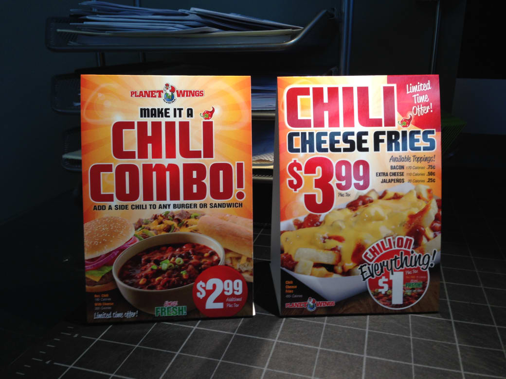
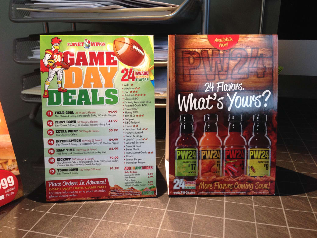
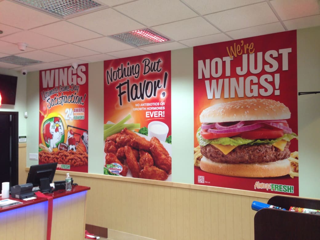
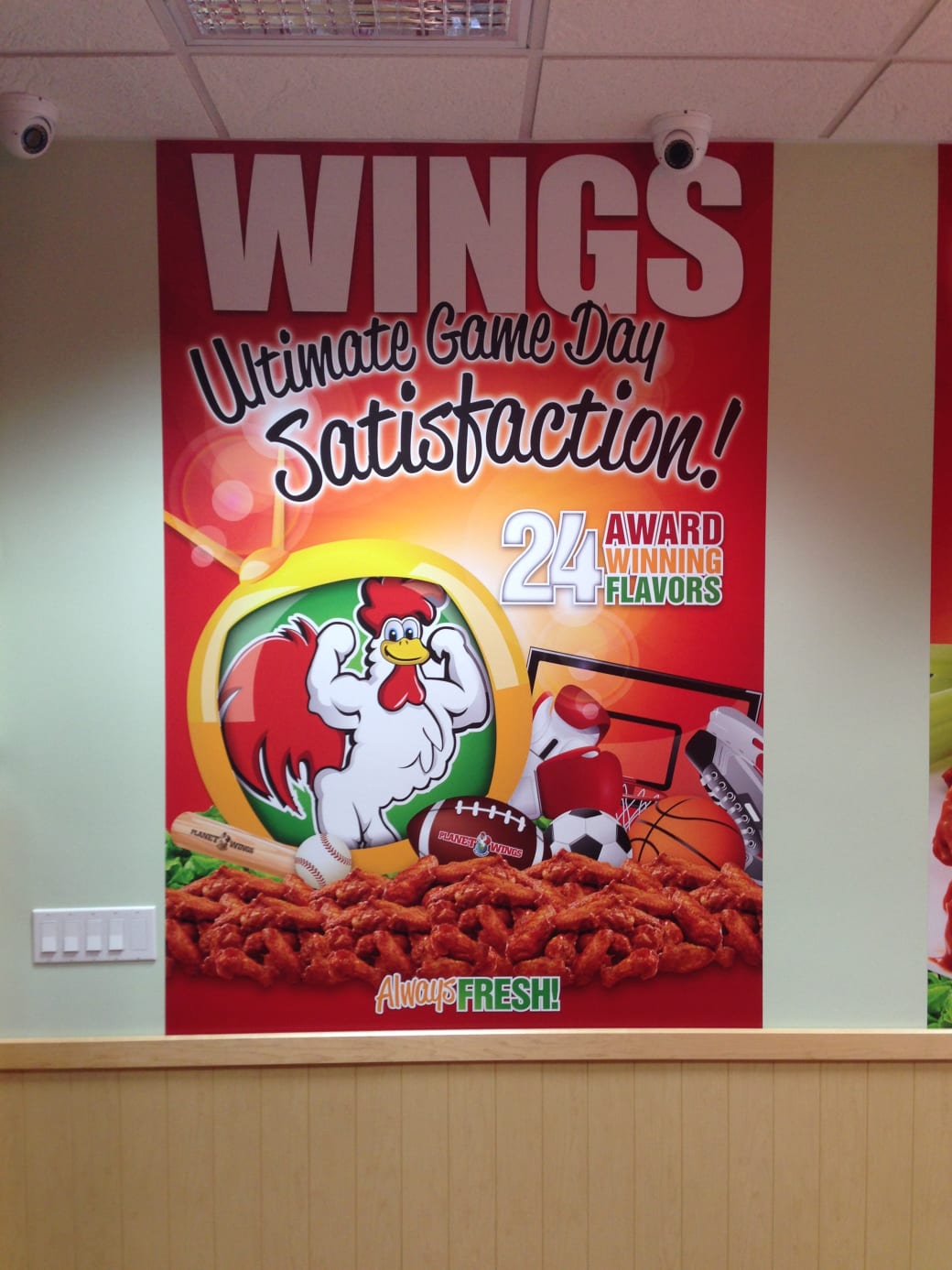
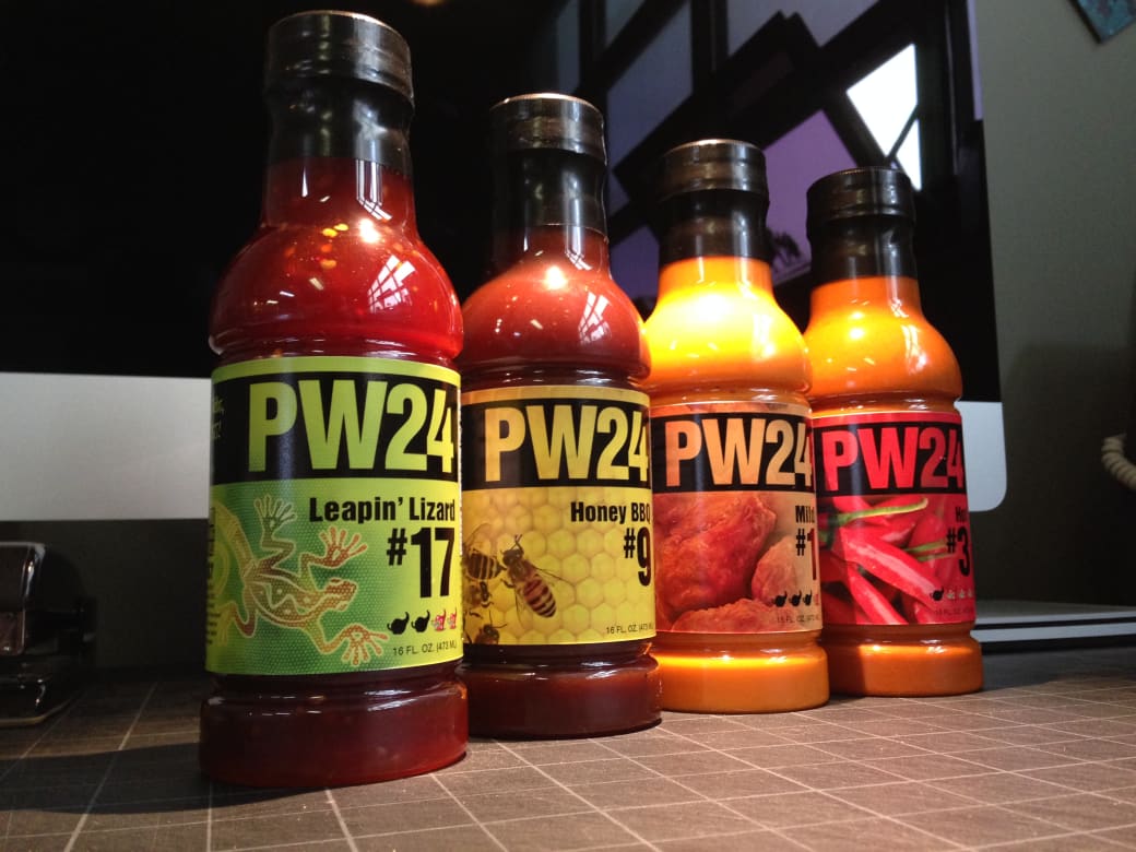
Restaurant brand identity and the PW24 hot sauce retail line: logo, packaging, interior graphics, signage, and menus, built to work on the plate and on the shelf.

01 The brief
Restaurant brands rarely jump to retail cleanly. Packaging is a different discipline than signage, with its own rules about shelves, labels, and legibility at arm’s length. Planet Wings needed both disciplines in one identity: a restaurant that feels right in the room, and a hot sauce line, PW24, that could move from the dining room to the store shelf.
02 What we made
The restaurant identity. Interior environmental graphics and storefront signage. The menu system. And the PW24 packaging system, with a distinct label for each flavor that still reads as one line on the shelf.
03 The standard
Two jobs, one system. The restaurant work has to feel like the place: bold, appetizing, easy to navigate. The retail work has to survive next to every other sauce on the shelf. Designing both inside one identity meant the sauce sells the restaurant and the restaurant sells the sauce, and neither needed a second agency to get there.
Let's build the next chapter of your brand.
Talk with a real person. No hard sell. · (914) 633-0088
· Related
Packaging Design, Product Design, Branding, Graphic Design, Printing, Storefront Graphics